suptitle
The task
Franke Foodservice Systems decided to change the navigation in their B2B webshop in 2022. Among other things, the client's requirements were:
- UX design and development of a flyout menu to display the first level of product groups from each available catalog.
- The flyout menu should display all catalogs that are shared with a customer
- Hovering over one of the catalogs should display the product groups
- After a user clicks on one of the product groups, he should land on the product overview page for the entire product group
Too many clicks: the previous UX
There are different catalogs per user, which in turn have several subcategories. Until the user reaches the product overview page of a catalog, he has to make often even up to 7 clicks, if he chooses the classic way via the navigation.
This process should be significantly simplified for the user.
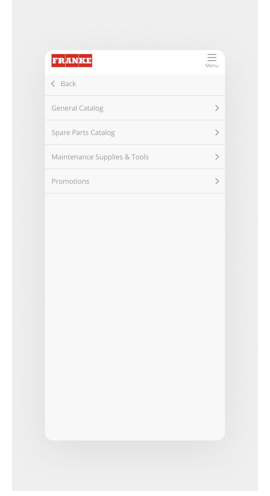
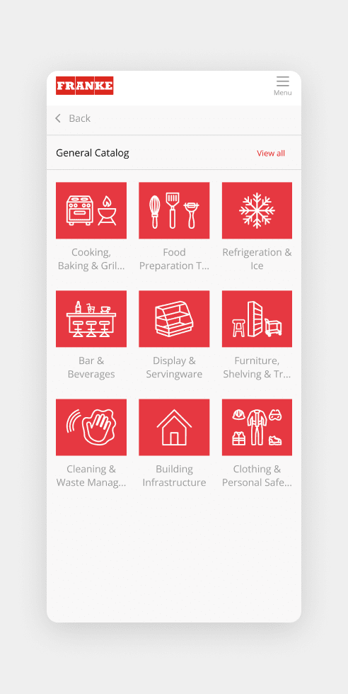
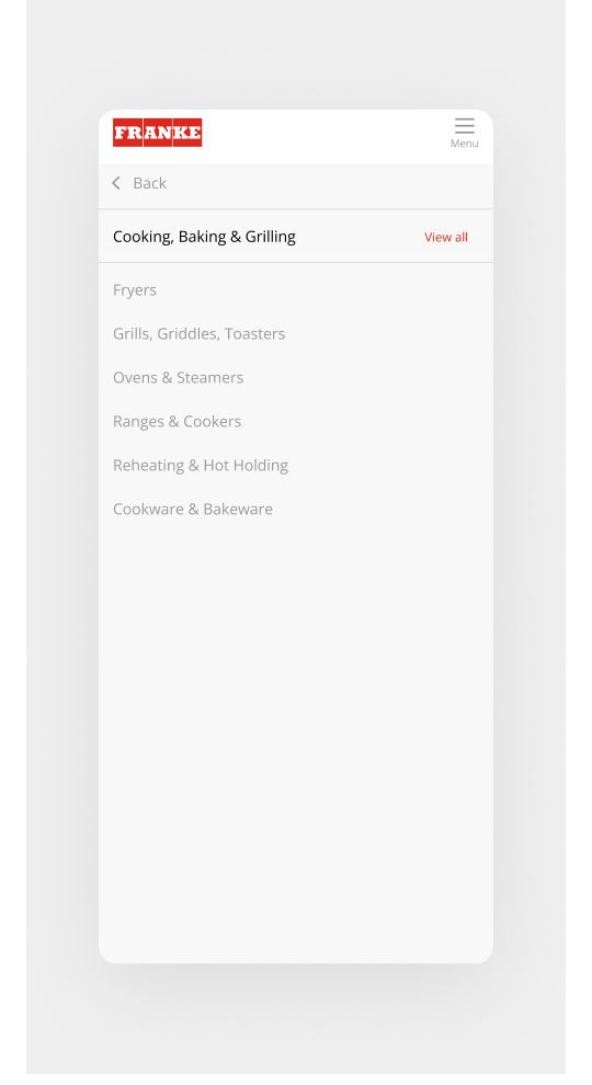
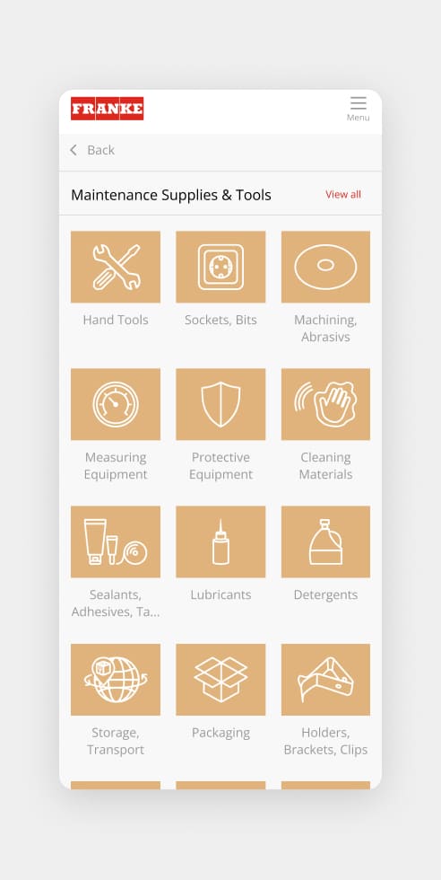
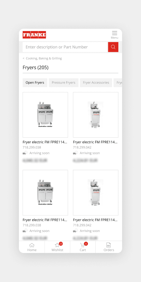
The new mobile UX of the e-commerce platform
Since a flyout menu is not feasible on mobile resolutions, we had to come up with another solution here:
- Overview of the catalogs in the open burger menu
- Subcategories are marked with an arrow to the right
- Back-button with arrow to the left to go back to the previous menu
- Name of the catalog with view-all button, which redirects directly to the corresponding product overview page
- First subcategory of the catalogs with pictogram as preview image